
A good logo has to do a strange amount of work in a very small space. It needs to be instantly recognizable at the size of a phone icon, print cleanly on a signboard, and still make sense in plain black and white on an invoice. For a small business in Pakistan choosing between a quick Canva template and a properly designed mark, the real question isn’t which one looks nicer today — it’s which one still works in two years, across every platform your brand ends up on.
What Actually Makes a Logo Work
A strong logo is judged less by whether people like it and more by whether it still functions once it’s shrunk, printed, or placed next to ten competitors on a shelf or a search results page. A few traits separate a logo that holds up from one that doesn’t.
Simplicity. The most recognizable logos usually strip down to a few clean shapes or a distinctive wordmark — not because simple is automatically better, but because a complex mark with fine detail or subtle gradients tends to fall apart at small sizes, like a social media profile photo or a favicon.
Memorability. A logo should be distinct enough that someone can describe it after seeing it once. Generic icons — a swoosh, a globe, a handshake — are memorable to no one because they’ve been used by thousands of other businesses.
Scalability. The same file needs to read clearly at 32 pixels and at the size of a billboard. This is largely a vector-versus-raster issue: a logo built as scalable vector artwork keeps its edges sharp at any size, while one exported only as a flat image starts to blur or pixelate the moment it’s resized up.
Versatility. A logo has to survive being printed in a single color, placed on a dark background, embossed on packaging, or dropped into a black-and-white fax or photocopy of an invoice. If a mark only works in its original full-color version, it isn’t finished yet.
Relevance without being trend-locked. The logo should feel appropriate to the industry and audience it’s for — a children’s clothing brand and a corporate law firm shouldn’t reach for the same visual language — without leaning so hard into whatever style is popular this year that it looks dated within a couple of seasons.
Common Logo Mistakes Small Businesses Make
Most weak logos aren’t the result of bad taste — they come from a handful of avoidable decisions made early, usually to save time or money.
The most common is relying on a free logo-maker tool or a generic template, which produces a mark that’s technically unique in its color combination but structurally identical to thousands of other small business logos built from the same shape library. A close second is overloading the design with too many colors, effects, or gradients, which looks fine on a laptop screen and breaks down the moment it needs to be embroidered, engraved, or printed in one ink color. Many businesses also never receive — or never ask for — a single-color or black-and-white version, which becomes a real problem the first time the logo needs to go on a stamp, a fax cover sheet, or anything that can’t reproduce color. Chasing a visual trend (a specific gradient style, a particular icon treatment) is another common trap; trends age quickly, and a logo built around one usually needs a costly refresh within a couple of years. Finally, a lot of businesses skip thinking about actual use cases — social media profile circles, packaging, vehicle signage, embroidery — until after the logo is finalized, at which point awkward cropping or illegible detail is much harder to fix.
Signs Your Current Logo Needs a Redesign
Not every logo needs to be replaced, but a few signals usually mean it’s time to consider one.
The logo looks visibly dated next to competitors in the same space, using a font style, color treatment, or icon convention that reads as several years old. It doesn’t scale — text becomes unreadable or details vanish once it’s shrunk to a social media icon or app thumbnail. Multiple slightly different versions of the “same” logo are floating around because there’s no single master file, so the version on the storefront sign doesn’t quite match the one on the Facebook page. The business itself has outgrown what the logo communicates — a company that started as a small local service and has since expanded regionally or shifted its positioning may find its original mark no longer represents what it actually does. And in some cases, the original source files were never handed over, which means every future edit starts from scratch instead of building on existing work.
What the Logo Design Process Actually Involves
A properly run logo project usually moves through a few distinct stages rather than jumping straight from a brief to a finished file.
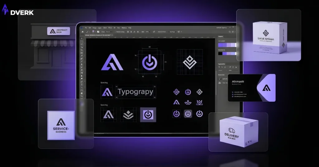
It starts with discovery — understanding the business, its audience, its competitors, and how the logo will actually be used day to day, not just what colors the owner personally likes. From there, a designer typically explores several different directions or concepts rather than presenting one option, since the goal at this stage is to find the right creative direction before refining anything. Once a direction is chosen, the work moves into refinement: adjusting proportions, spacing, color, and typography until the mark is technically sound as well as visually right. Adverk’s graphic design services build logos through this same kind of process — working from the brand’s actual persona and use cases, with revisions built in, rather than handing over a first draft and calling it final.
Files and Formats You Should Receive
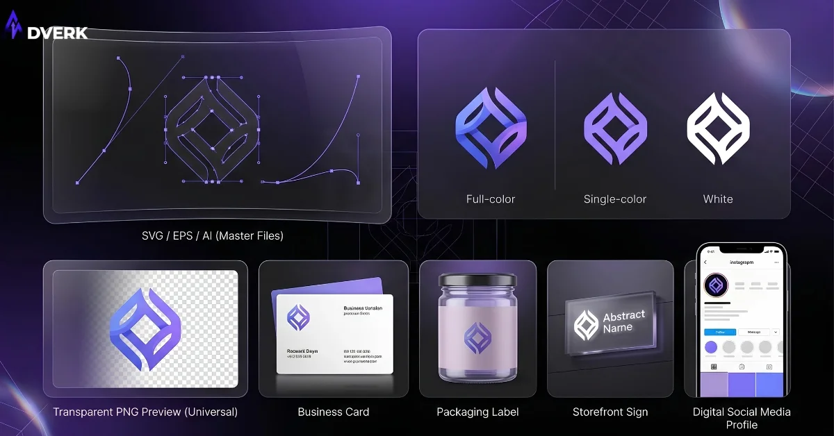
The design itself is only half of what a finished logo project should deliver — the file package matters just as much, because it determines whether the logo can actually be used everywhere it needs to be.
At minimum, that should include vector source files (formats like AI, EPS, or SVG), which is what a printer, sign maker, or embroiderer will need for anything that gets resized or reproduced physically. It should also include ready-to-use image files — typically PNG with a transparent background — sized appropriately for web and social use. A complete package includes color variations: full color, a single-color version, and a black-and-white or white-only version for use on dark or non-standard backgrounds. If any of these are missing, most future edits or reproductions end up costing extra, simply because someone has to rebuild what should have been delivered the first time.
Freelancer or Agency: A Quick Note
Both freelancers and agencies can produce strong logo work — the right choice usually comes down to budget, how much strategic input is needed beyond the logo itself, and how much process and accountability matters for the project. This is really a subset of a bigger decision, and if you’re weighing that choice in more depth, our full guide to choosing a graphic design agency in Pakistan covers portfolio evaluation, pricing expectations, and the questions worth asking before you commit.
A Logo Is Only the Starting Point
A logo is usually the first piece of a brand identity, not the whole thing. The decisions that go into it — the shapes and spacing described in the basic elements of graphic design, the palette drawn from a deliberate approach to color theory, and the typeface choices covered in typography — all extend beyond the logo itself into business cards, social templates, packaging, and every other place the brand shows up. A logo that’s designed in isolation, without those decisions considered together, tends to be the reason brands end up looking inconsistent across platforms even when the logo itself is fine. If you’re still deciding whether you need a logo or a full identity system, our guide on brand identity vs. logo design breaks down the deeper differences between branding and logo design.
Frequently Asked Questions
How much does logo design cost in Pakistan?
Pricing varies widely based on the scope of work, how many concepts and revisions are included, and whether the project covers just the logo or a fuller identity package. Because the right scope depends on the specific business, it’s worth discussing directly rather than comparing against a generic number.
How long does a logo design project usually take?
A straightforward logo project typically moves through discovery, concept exploration, and refinement over a few weeks, though the timeline can extend if the brief changes mid-project or if a fuller brand identity package is involved alongside the logo itself.
Can I ask for changes if I don’t like the first concepts?
Yes — a properly structured logo project includes revision rounds specifically so the direction can be adjusted before anything is finalized. It’s worth confirming upfront how many rounds are included and what counts as a revision versus a completely new concept.
Is a free logo maker tool good enough for a small business?
Free tools can produce something usable to launch with, but they typically pull from a limited shape and font library shared by thousands of other users, which makes true differentiation difficult. They also often fall short on the file variety — vector formats, color variations — that a growing business eventually needs.
What’s the difference between a logo refresh and a full redesign?
A refresh keeps the core concept and cleans up execution — better spacing, an updated typeface, a more versatile color set — while a full redesign starts from a new concept entirely. Which one fits depends on whether the existing mark still represents the business, or whether the business itself has moved past what the original logo communicates.
What files should I receive when the logo is finished?
At minimum: vector source files for resizing and printing, transparent-background PNGs for digital use, and both full-color and single-color versions. Missing any of these usually means extra cost later when the logo needs to be reproduced somewhere the original files can’t support.
If your current logo is holding your brand back — or you’re starting from nothing and want it done properly the first time — Adverk’s graphic design team can walk you through the process. Book a free consultation to talk through what your brand actually needs.