
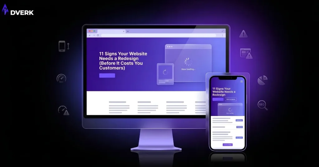
If your website loads slowly on a phone, doesn’t reflect what your business actually offers today, or gets visitors without turning them into calls, messages, or bookings, it needs a redesign — regardless of how recently it was “updated” with new photos or a color tweak. The signs below are the ones that actually predict lost business, not just cosmetic wear.
For businesses in Pakistan, this matters more than it used to. Most visitors are checking you out on a phone, often after finding you through WhatsApp, a Google search, or a social post, and they decide whether to trust you within seconds of the page loading. A dated or clunky site doesn’t just look old — it quietly tells people to keep scrolling to a competitor.
1. Your design looks noticeably older than your competitors’
Design trends move fast. Heavy drop shadows, tiny stock icons, cramped text blocks, and dense homepages that try to say everything at once were normal a few years ago and read as dated now. If a new visitor can tell your site is old before reading a single word, that first impression is already working against you.
2. It’s technically responsive, but not actually built for mobile
Many older sites “work” on a phone in the sense that nothing is broken, but buttons are too small to tap accurately, menus need three attempts to open, and forms are painful to fill in with a thumb. Since the majority of traffic for most Pakistani businesses is mobile, a site that merely survives on mobile — instead of being designed for it first — is losing inquiries every day.
3. Pages take too long to load
Every extra second of load time gives a visitor more reason to leave before they see what you offer. Slow load times are usually caused by unoptimized images, bloated page builder code, or outdated hosting, and they get worse over time as more plugins, images, and tracking scripts pile up on an old build.
4. Traffic comes in, but inquiries don’t
This is one of the clearest signs your website needs a redesign: people are finding you, but they’re not calling, messaging, or filling out your contact form. That gap usually means the site isn’t making the next step obvious — the value isn’t clear fast enough, or there’s no confident call to action guiding the visitor toward it.
5. Visitors can’t find what they’re looking for quickly
If someone has to hunt through your menu to find your services, pricing approach, or contact details, most won’t bother. A visitor should be able to understand what you do and how to reach you within the first few seconds on any page, not just the homepage.
6. The content doesn’t match what you actually offer anymore
Businesses evolve — new services get added, old ones get dropped, pricing models change — but the website often doesn’t keep up. A site describing services you no longer provide, or missing the ones that now drive most of your revenue, isn’t just outdated information; it’s actively confusing the people you most want to convert.
7. There’s no clear next step on any given page
Every page should answer an unspoken question: “okay, what do I do now?” If that answer isn’t obvious — a visible way to book a call, send a message, or request a quote — visitors leave without acting, even if they were genuinely interested a moment earlier.
8. Small changes require a developer every time
If updating a phone number, adding a new service, or changing a price means waiting on a developer for a simple text edit, the site was likely built without a proper content structure behind it. That friction usually means information stays outdated for longer than it should, which feeds directly back into sign #6.
9. It wasn’t built with search visibility in mind
Older or hastily built sites are frequently missing the basics: clean URLs, proper heading structure, fast-loading images, and pages that clearly target what people are actually searching for. That’s a redesign issue as much as an SEO one — you can’t bolt good search performance onto a structure that was never built to support it.
10. Trust signals are missing or broken
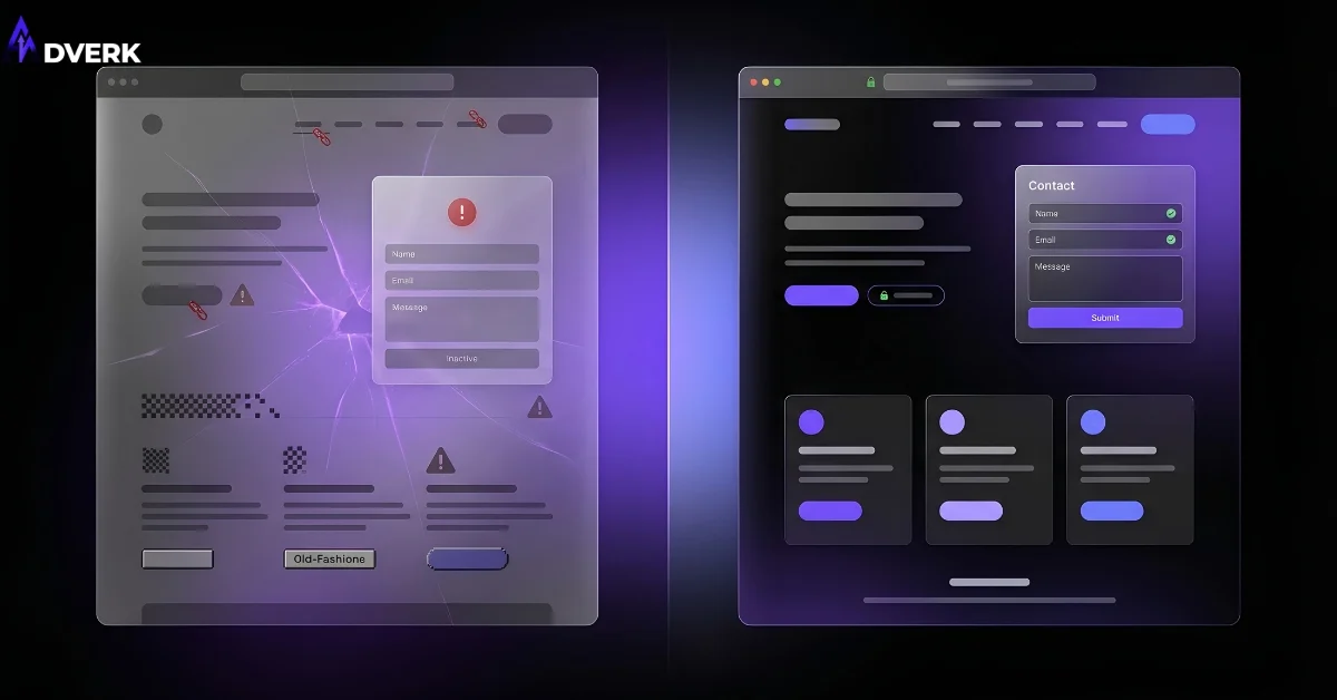
Broken contact forms, dead links, missing SSL padlocks, or a site that hasn’t been touched in years all quietly erode confidence. People are cautious about who they hand their contact details or money to online, and a site that feels neglected makes that decision easy — they just leave. A full breakdown of what actually builds (and breaks) visitor confidence is covered in our guide to website trust signals.
11. Your brand has moved on, but your website hasn’t
If you’ve refreshed your logo, tone, or positioning anywhere else — social media, print materials, how you describe yourself to clients — but your website still reflects the old version of your business, it’s sending mixed signals to anyone comparing the two.
What to do once you’ve spotted a few of these
Finding two or three of these signs on your own site doesn’t mean you need to rebuild everything from scratch. It means it’s worth having someone look at the site as a whole — design, speed, structure, and conversion path together — rather than patching individual pages one at a time. A redesign done well fixes the underlying structure so the same problems don’t resurface in six months.
If you’re checking off more of this list than you’d like, it’s a good time to get a second opinion. Adverk’s web design services are built around exactly this — user-first, mobile-first sites that turn visits into actual inquiries, not just more traffic. For businesses whose website problems are tied to the platform underneath the design, our web development team can also assess whether the current setup can be improved or needs to be rebuilt on stronger footing.
Frequently Asked Questions
How many of these signs mean I need a redesign right now?
There’s no fixed number, but two or three overlapping signs is usually enough to justify a proper look at the site as a whole, rather than patching individual pages one at a time. A single isolated issue (like one broken form) might just need a fix, not a full redesign.
My site looks fine to me — how do I know if it’s actually outdated?
Ask someone outside your business to look at it cold, or compare it directly against two or three competitors’ sites side by side. Design fatigue is easy to miss when you look at your own site every day; a fresh set of eyes usually spots it immediately.
Is a redesign the same as just changing the visual style?
Not necessarily — a real redesign often touches structure, content, and conversion path along with visual style, since a purely cosmetic refresh on a broken structure just recreates the same problems in new colors.
How long does fixing these issues typically take?
It depends on how many signs apply and whether the fix is a visual refresh or something deeper like a platform or structure change. A focused redesign addressing the main issues can often move faster than a full rebuild from scratch.
Can I fix a few of these signs myself without a full redesign?
Some, like updating outdated content or fixing a broken form, are quick fixes. Others — like mobile usability, load speed, or a confusing structure — are usually symptoms of how the site was originally built, and tend to resurface again even after a manual patch unless addressed at that level.
The most useful first step is usually a short, honest look at where the current site is losing people. You can book a free consultation to walk through your site together and get a clear view of what’s worth fixing first.