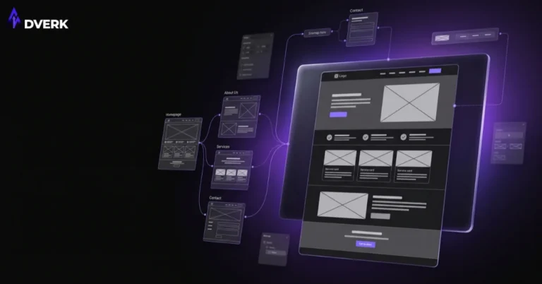

Balance in graphic design is how visual weight — created by size, color, and density — is distributed across a layout. A balanced design feels stable, whether or not it’s actually symmetrical; an unbalanced one feels like it’s tipping toward one side, even when nothing is technically broken.
Symmetrical balance
Symmetrical balance mirrors elements evenly around a central axis — the same weight on the left as the right, or top as bottom. It reads as formal, stable, and traditional, which is why it shows up often in classic branding, invitations, and certificate-style layouts. Used everywhere, though, it can feel static or predictable.
Asymmetrical balance
Asymmetrical balance distributes weight unevenly but still achieves stability — a large image on one side balanced by a block of text and white space on the other, for example. This is harder to get right than symmetry because there’s no built-in formula, but it produces more dynamic, modern-feeling layouts, and it’s the dominant approach in most current web and marketing design.
Radial balance
Less common but worth knowing: radial balance arranges elements around a central point, like spokes on a wheel. It draws the eye toward the center first and works well for badges, circular logos, or any design meant to feel like a single focal point radiating outward.
How to actually judge balance
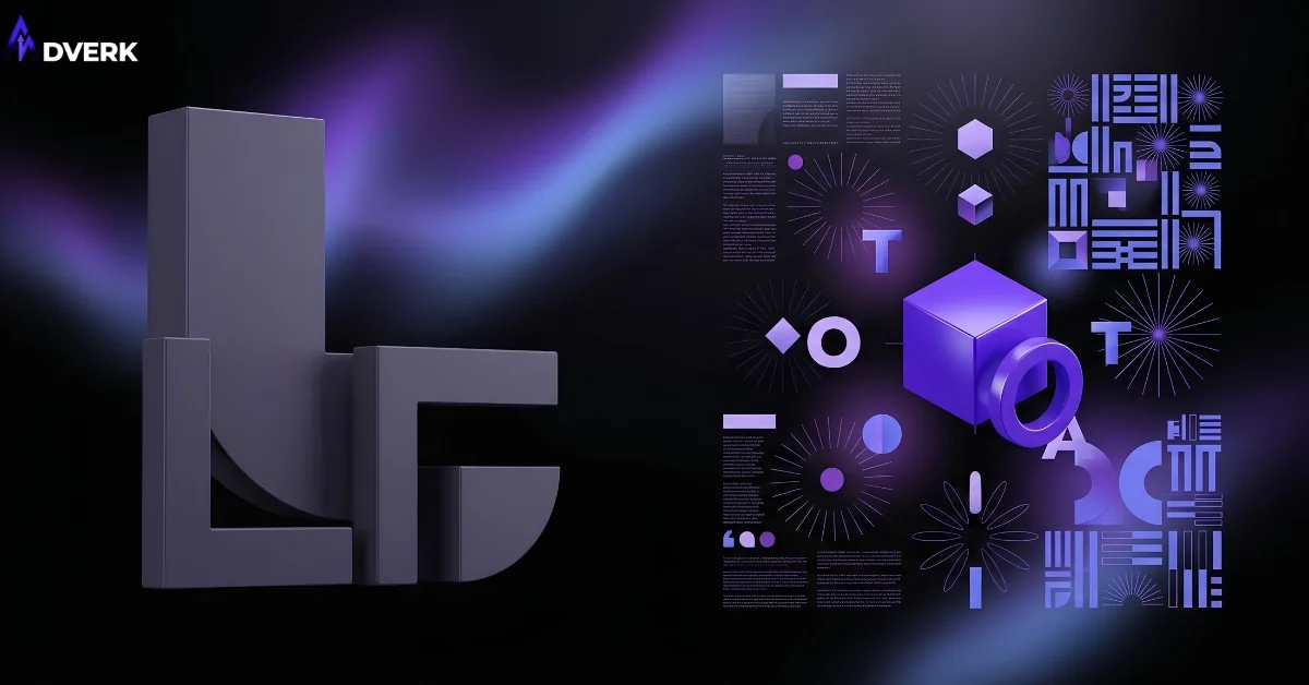
Visual weight isn’t just physical size — a small, brightly colored element can carry as much weight as a larger, muted one. Dark colors generally feel heavier than light ones. Text-dense blocks feel heavier than white space. A quick gut check: does one side or corner of the design feel like it’s pulling more attention than everything else combined, without a clear reason for it? If so, balance needs adjustment, either by resizing, repositioning, or reducing the competing element’s visual weight.
Common balance mistakes
Treating balance as “must be symmetrical,” which produces stiff, dated layouts for use cases that call for more energy. Overloading one side of a page (usually with text) while leaving the other nearly empty without intent. And ignoring color weight — assuming a layout is balanced because element sizes match, while one bright color quietly dominates the whole composition.
Balance and the other principles
Balance interacts closely with proximity and overall layout structure — how elements are grouped affects how their weight reads. See the complete picture in our guide to the principles of graphic design.
Frequently Asked Questions
Is symmetrical balance ever the wrong choice?
It can feel static or predictable if used everywhere, especially for brands wanting a more modern, energetic feel. Symmetry works best for formal, traditional, or trust-heavy contexts; asymmetrical balance suits most current web and marketing design better.
How can a small element ever balance a larger one?
Visual weight isn’t just size — a small, brightly colored element can carry as much weight as a larger, muted one, and dark colors generally read as heavier than light ones. Balance is judged by total visual weight, not just physical dimensions.
What’s radial balance actually used for?
It’s most common for circular logos, badges, and any design meant to feel like a single focal point radiating outward, since it naturally draws the eye toward the center. It’s less common than symmetrical or asymmetrical balance because most layouts aren’t built around one central point.
How do I check if a design I already have is balanced?
Look for whether one side or corner pulls more attention than everything else combined without a clear reason. If so, that’s usually fixable by resizing, repositioning, or reducing that element’s color or size weight.
Is balance the same as symmetry?
No — symmetry is one way to achieve balance, but asymmetrical layouts can be just as balanced if visual weight is distributed thoughtfully. Balance is about the outcome (nothing feels like it’s tipping over); symmetry is just one technique for getting there.
If a layout feels “off” without an obvious reason, poor balance is a common, fixable cause. Adverk’s graphic design services account for visual weight in every layout decision. Book a free consultation for a second opinion on your current materials.