

Alignment in graphic design is the practice of lining up elements — text, images, buttons — along shared edges or a common axis, so a layout reads as organized rather than scattered. It’s one of the least glamorous principles and one of the fastest ways to make a design look either professional or amateur, depending on whether it’s there.
The three basic types
Left alignment is the default for most body text in Western languages — it gives every line a consistent starting point, which is what actually makes long text easy to read. Center alignment works for short blocks (headlines, quotes, invitations) but becomes harder to read as text gets longer, because each line starts in a different place. Right alignment is used sparingly, usually for captions, dates, or secondary information positioned deliberately against a left-aligned anchor.
Why misalignment is so noticeable
Humans are extremely good at spotting things that are almost, but not quite, lined up — a logo a few pixels off-center, a paragraph that starts slightly further right than the heading above it. These small inconsistencies register as “something feels off” even to viewers who couldn’t name what’s wrong. Perfect alignment, on the other hand, is often invisible — nobody consciously admires good alignment, they just don’t notice anything wrong.
Alignment beyond individual elements

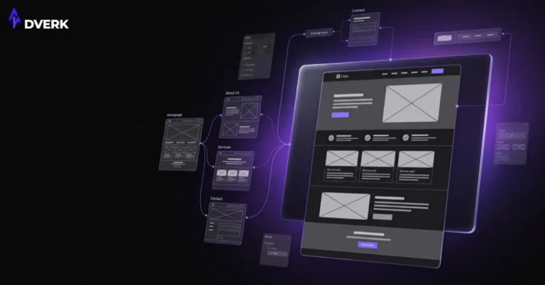
Alignment also applies at the layout level, through grids: invisible columns and rows that every element on a page snaps to. A grid-based layout is what allows a page with dozens of elements — images, text blocks, buttons — to still feel unified rather than assembled piece by piece. Most professional design tools default to grid systems for exactly this reason.
Common alignment mistakes
Mixing alignment types within the same block of content (some lines left-aligned, others centered) without a clear reason. Relying on “eyeballing” instead of using guides, grids, or snapping tools, which almost always introduces small inconsistencies. Centering long paragraphs of body text purely for aesthetic reasons, which measurably hurts readability. And ignoring alignment across separate elements that should relate to each other, like a caption that doesn’t line up with the image it describes.
Alignment and the other principles
Alignment works closely with proximity — grouped elements need consistent alignment to actually read as one unit rather than a loose cluster. See the full picture in our guide to the principles of graphic design.
Frequently Asked Questions
Is centered text ever the right choice?
Yes, for short blocks like headlines, pull quotes, or invitations — it just gets harder to read as the text gets longer, since each line starts in a different place. Left alignment is the safer default for anything more than a sentence or two.
Why does slight misalignment feel “off” even when I can’t identify the problem?
People are very good at unconsciously noticing things that are almost, but not quite, lined up — a logo a few pixels off-center, or a paragraph starting slightly further right than the heading above it. It registers as unpolished before you can consciously say why.
What’s a grid, and do I need one for a simple project?
A grid is a set of invisible columns and rows every element snaps to, which is what lets a page with many elements still feel unified. Even a simple project benefits from one — it’s what turns “eyeballed” placement into consistent, professional-looking alignment.
Can good alignment fix a design that’s otherwise weak?
It helps more than almost any other single fix, since misalignment is one of the fastest, most visible signals of an unpolished design — but it works alongside other principles like contrast and hierarchy, not as a full substitute for them.
How is alignment different from proximity?
Alignment is about lining elements up along shared edges. Proximity is about how close together related elements are placed. They work closely together — grouped elements (proximity) still need consistent alignment to actually read as one unit rather than a loose cluster.
If your marketing materials look slightly “off” without an obvious reason, inconsistent alignment is a common, fixable cause. Adverk’s graphic design services build every layout on a proper grid from the start. Book a free consultation for a second opinion on your current materials.